Showing posts with label client. Show all posts

Wednesday, 5 December 2012

Is Total Gadget Immersion Good or Bad for Kids? [INFOGRAPHIC]

As according to Mashable, US based Tablet usage from, and in with the consideration of children.
-->

LAIRD, S, 2012. Is Total Gadget Immersion Good or Bad for Kids ? [INFOGRAPHIC] [online]. Mashable. Available at: http://mashable.com/2012/05/16/gadgets-kids-infographic/ [accessed 5th December 2012].


Sunday, 2 December 2012

designs gone so far off point


anyone that takes peeks should give me feedback.
genuine thing. Ive sort of lost direction, and seem to be doin design based on what I like rather than what's gonna be relevant

bear bare bayuh in mind a lot of these nasty box colours are placeholders

Saturday, 1 December 2012

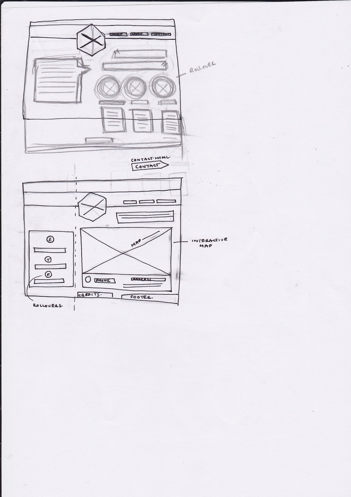
flufffed out wireframes for ATRG


LOGO:
choosing a six sided shape a gon, sort of like a sheld incorporating an abstract typeface based on the machinery i did a see'er on from the visit and captain Benns' kindly uploaded photographs.
I'm not sure if it's gonna work, or if it's gonna be too much my style, which could drown out the original concept. But I guess I'll know for sure by the end of tonight when it's put together. I'm hoping it'll be kinda cool and graphic'y something I'm proud to put my name to, but be full of energy.

going for a colour scheme of a bee a ootiful nebula i found, pretty current in colour trends as well, blue greens pinks apricots torquoise forest greens and moo-yur.

logo start up


Wednesday, 28 November 2012

50 words


With a never-ending love and deep-rooted understanding of both digital and print, Lucy’s work is influenced by her curiosity with emerging technologies and communications. Exhibiting her interpretation of the world through engaging experiences entangling colorful thought, creative spirit and visual communications with principled functionality, she produces innovative, quality driven work.

Thursday, 22 November 2012

client

www.el-ay.co.uk/shell_site/galaxy.html

test of adding the galaxy and parallax for added weirdness.
probably not one thats gonna work.
need ot find out how to animate my galaxy now. arg

Tuesday, 20 November 2012

http://www.el-ay.co.uk/shell_site/index.html

I've broken down bad this week. monday night and tonight spent balling into my aldi prices grapefruit collection.

Had another meeting with David, started to code up my shell, ready for animated galaxy hopefully coming Thursday.

I've got my css rollovers in, and the hidden div containing product content on the click.
problems ive gotta solve are :

how to use more than one hidden div for each link, or how to sort dynamic content for the same div.

how to make the hidden div strike across the whole page in a real nice bold way

how to animated the galaxy

hopefully thursday morning will help me some

Monday, 19 November 2012

figsake

DEVELOPMENT.

turns out despite the inital excitement, tisnt a parralax thats gonna save me.


to get the information of products displayed I was looking into combining the pan and zoom and the parallax (both can be seen if you scroll back a few posts or search client labels)  My thoughts were reckoning it'd be anice clean minimalist way of displaying information, thatd be pretty interesting and add to the overall feel of the journey.
but me plans were foiled.

the parallax is made up of 4 different layers containing divs, containing the circular image, i assigned the zoomTarget class to each of the layers, but because of the way I was trying to use the parallax, the browser could only read through to one of the layers, the bottom one, rendering the first 3 pointless, and use of the last one pretty painful.
I adda surger session with David this morning where we shpent a considerable amount of time reading back through tutorials i'd used to jig them around and get it working, before the realization hit that this wasney the way to do it.
David helped me with a load of java'rejigging in the source document, before a discussion took place in search of a batter more efficient solution.

positive results though, after more thought the pan and zoom is probably a ridicolous notion ( as a design choice, i reckon theres gonna be a better way of doing it), terribly unefficient in actually displaying the information, and a load more hassle than its worth. Tonights going to spent coding the shell and design of my site, before tomorrow another surgery session will get me back on the way to creating the galaxy using jquery and copious amounts of Davids time.

over and out

Tuesday, 13 November 2012

Monday, 12 November 2012

galaxy possibly taking shape

in the roughest chuffin way possible.

Real basic, real choppy, but I've got a few layers in, and placeholders for images or icons.
Sort of lost site of where I'm going design wise, my brains gone grey. Gonna head in tomorrow and see David to see if I can get some help with it and how to mix up this with the other jquery coding I got's sorted, the pan and zoom.


NEXT STEPS :
get them mixed in together, hopefully with a fixed one page nav, (hopefully dynamic content at some point, maybe later)
start branding, and fleshing out the skeleton I've got going on

work in progress at th min :
http://www.el-ay.co.uk/jquery_client_test/jparallax-master/index.html


so harsh ! ive forgotten how much fun designing is, haha cant wait to get to that bitt

Thursday, 8 November 2012

wireframes


development from my intial wireframe.
I want the whole thing to be sleek as fuck.
I'm dead wary of having too many things fighting for attention and distracting from the sleek, solid concept. I think thats strong enough to carry the site without over complicating it with fancy jquery. I want to try and keep it to one fixed page if possible, but im not sure on the amount of content we need to integrate with our designs. tutorials have indicated we can make a lot of it up, which would be sound. I want to, if i have to put in more pages, have them smooth and effortlessly changing with a fixed nav and footer. I've had a look at different navigation, to see if i can place the content within laarge harsh striking bars, as there isnt that much, but i dont wanna end up with a site layer on layer on layer. onionshite.
I really like the idea of sections that expland on the original page, but it needs to be neat and minimalist, not cluttered and unnecessary. Initial ideas, which I think will provide a good starting point. Reckon this is one to fathom as I'm coding, when i get a better feel for how this stuffs gonna look together, all real new to me so my pre conceptions and assumptions could be way off.

inshpirational shites for client

I want a one page fixed webbersite, using real nice greys and a feature colour to add abitta life. not stone dead nall that.
here a are a few real nice, mostly one page scrolling site, ive stumbled upon this evening.
incred use of minimalist design, real hard to have character, personality and a buzz to remember using real dim colours. these have killed it.


http://agenciawee.com.br/


this is a real nice experience, pixellated in bits, be nicer if i knew what the bloke was saying. but its a planned journey, noice mix of film and web, but led moreso by the web which i recks is quite unusal.
horrid bit about a third of the way in where theres a close up on that weird guys face, haha rest is sound


http://www.kiinnostus.fi/autokuume/


again, this is almost a film like experience. verging on animation. real nice convergence of pathways.
whole things in greyscale, but not at all DEAD


http://pitchfork.com/features/cover-story/reader/bat-for-lashes/


this is the portfolio of a designer, as a load of the more experimental ones are, and is in my list cos it does a nice job of using icons or symbols as representation for nav, or the about section, or an expected amount of content.


http://christophermeeks.com/work


http://www.tripwiremagazine.com/2012/07/parallax-scrolling.html

GITHUB

well worth taking a peek at, so many tutorials and packages hanging around on there that are real bloody helpful.


found me method


Tutorial today confirmed my worst fears, It’s a parralaz I need to implement to get the desired effect to my site.
I wasn’t wrong by dabbling in flash, but that’s an outdated method of doing what I’m after, it’s a variation on a classic parallax, which is incred.
My external client project next year is something im badly eager to start, ive met the client and we’ve talked about wordpress, mobilization, big cartel, but I’ve been badly harbouring after the introduction of a more classic, almost animation like parallax, one page scroll, both horizental and vertical. Only a concept, but I wanted to get to grips with this at some point so if I can introduce it into both projects, and get an understanding of how they can be used and manipulated to create different effects, rather than just the one. Bloody sound.

Next step is thumbnails, design ideas, planning out the wireframe of my site now its an achievable notion and getting immersed in code. I think once my wireframes are up, the way I talk about my project will make more sense, at the minute I know what im on about, not sure who else does.

I want the site to be one page only, but with 5 pages of content tucked away neatly. I’ve been looking at maybe a blog page, or another if it gets too cluttered, but the ideal is one. Here’s a link to a pan and zoom I’ve been thinking about as a way of displaying content. Each box would be an icon, the content displayed would be for the products and what not. The coloured boxes would be colourless divs with the image I choose to represent the link (circle.star) being an image within, so the screen would zoom to a size of my choosing.
 http://www.el-ay.co.uk/zoom_test1/test1/index1.html


Im’a use html 5 and percentages all the way through so my sizing and proportions remain the same on laptops and my huge 24 inch desktop galore.

getting closer

http://code.google.com/p/jbackground/


I THINK IT MIGHT BE A PARRALAX ! as one way of going about it. a variation.
I'd rather get to grips with it this way that flash, i wanna do a parallax animation sorta thing for external client so be good to get to grips with a different version/effect.


http://stephband.info/jparallax/index.html

BEERCAMP

Both in twenny twelve and the year a'fore, Beercamp have done incred websites.

This year they've got a pop up book (context) and a moving background (client)

Im having a load of trouble finding out how to get the effect and experience I want, the moving background. But it's something I definetly wanna learn, that I can use my cleint project as a vehicle for, so Im gonna struggle on. Its a real nice effect that gives alot of interaction for the user, although I wanna use it subtly.

Use investigated Jquery, and now im on flash. research, not too much practical yet.

Wednesday, 7 November 2012

flashin flashfox

http://forums.adobe.com/thread/812443


Looks like it might be a load of flash that's gonna get me the end result I need.
shit

examples:
http://www.liveagg.com/

http://www.haterpaintball.com/


tutorial :

http://www.jesseharding.com/blog/2008/02/22/creating-a-background-that-moves-with-your-mouse-in-flash/

http://www.kirupa.com/developer/flash8/interactive_image_pan.htm

mixed with

http://www.adrianpelletier.com/2009/05/31/create-a-realistic-hover-effect-with-jquery-ui/


ATRG trip aboot the place


written up notes above.


Trip to Bonnington and a walk about the guys facilities, small intro in to some of their stuff, the processes and machines.
Although it wasnt directly related to the brief I'd chosen I found it real useful. After meeting the TEAM and getting abit of insight into what they do, I think my idea needs to shifted about abit.
Ive been dead keen on hammering space home, but I think the concept of using the thread needs to be the one I investigate more.


After listening to what the fella had to say I was left feeling my idea of space might be a bit irrelevant. I got the impression from the 'client' they’re pretty close KNIT. waaa The group appear to be really direct and focused. Pick a problem, solve it, pass it on to a spin out company, start again. That’s not at all what I was expecting from a research group. It made me wander if my ideas a bit fancy, unnecessary and not relevant to the client. I’ve been questioning whether my loyalty lies with the client, or the brief. I got home and immediately changed my mind, setting up shop with the idea of the piece of thread (earlier mentioned concept) as that’s more direct, that after meeting them, I think they’d be into more.
Buuut.

After writing the post for me blog, I changed me mind.
I think my responsibility and loyalty lies with both the client, and the brief and myself. I want to create a piece of work I’m real pleased to show off, both with design and the considerations behind it, I want it to be fulfilling the criteria of the brief, creating a sense of anticipation and awe, but a relevant representation and branding to the client. This has led me to realise the best option is going to be, combining both concepts, so perhaps space would create a new identity that matches the problem solving area of their process. It fits the brief so well. Having said that, my brief allows me to rebrand, to create a new identity and character of the company to some extent, so there’s wiggle room.
Best case scenario, carry on sailing the jquery seas to get some stuff ready for David’s session next Thursday, investigate, explore and develop both ideas to a point where I’m comfortable and and have my journey mapped.

Friday, 2 November 2012

CRAFTSMAP !

http://www.jscraft.net/plugins/craftmap.html

this is so close to what I want !!

http://srobbin.com/jquery-plugins/backstretch/
background !

http://speckyboy.com/2010/05/13/50-fundamental-jquery-controls-and-rich-ui-components/


http://speckyboy.com/2012/04/10/40-recently-released-jquery-plugins/
so many good tutorials and demos on this site well worth taking a look at. 

Thursday, 1 November 2012

prezzeh