Monday, 28 February 2011

3d animation world one.

i want this figure fropping down like a wooden model, 3d of course, but not a real bloke. cos thatd be weird and itd look like it was hanging itself which wouldnt be somethin i wanted my target audience gettin in their faces.
guess who im aiming it at ?
i want it to be a plane simple, textureless wooden man, animated when he falls down by swinging limbs, the dots on the diagram are where the limbs and that are attached.
contrary to all these posts, which im pretty sure are mandatory, i can draw. ill post somet good later. callies birthday card maybee

the brief says we only ave to do three, depending on how cocky im feelin imight try n do 4 maybe 5. im not too sure about this one tho, the way id go about doing it, it might just have to be something cool to look at, instead of a boring wallpaper.
incase ya cant tell, there brains n organs in jars, which might expllode as the cart shimmys past, or might just flop around, be simpler to make.
im scared im imagining things that are way past my actual technical ability and skills. i really wanna make this happen, and ill give it my aboluste best shot. i dont wanna let my idea down.
something else bothering me is the track, the wall dimensions and wall paper idea. i really need t leave this world, and get the others to this kinda level concept wise so i can start seeing what im capable of, and whats expected. haha expect a suicidal post tuesday night.
3d animation entrance.

im not sure whether im gonna do a wall paper, or whether to make th trees and bird 3d.
im not even sure if ive done this right, the friday lady said it needs to be some sort of inside wall, but everyone else seems to be doing doorways and entrances.
i hope it is this way, otherwise im not gonna bother. i like what this would add to my design, its pretty casual and sweet.
ive done a few notes on how i might go about making it, hope youre readin this dan bissill, cos this is all for you.. haha
3d animation cart.

its a kind of lizard monster, not sure how ill do it, on the right is how i think it could be done, but definetley gonna involved help off someone. watch out charlotte im coming after ya.
its my standard style, but i really like it, think its gonna work pretty well, although im not sure if you even get to see it in the final animation.
pretty happy with all my back up work, its staying true to how i wanted it when i first had a think about th project brief, im smashin it time management wise, so seems ive learnt somethin from the interactive space one.
bring on the next post, which i can reveal is gonna be about the entrance.
3d animaton theme.
i forgot to mention in the last post, ive had to condense it from 5 to 3 worlds, haha as you probably know im allergic to animation so i think i was being massively over ambitious. im all for giving it ago, but i dont wanna drown in editable polys.
 thanks to the ever handy brain storm, i figured out my themes for my worlds.
im well 'appy with my 3 worlds as well :) i've pretty much got ahead of myself with this project cos i had a job, and thought it was gonna take up a load of my time and didnt wanna fall behind, but i quit on the first day again, absolute classic of mine, so now im a few steps ahead and plannin how to create all this stuff i wanna get made.
it seems easy, when im infront of the pc tho, probs shrink back to myself, but as it stands, im winnin. wheeey
but, my three worlds :
1. its a kinda scary mad scientist's lab, forward slash dentisty place. gonna be all immaculate, load of posibilities about 'scare scenes' with this one.
2. this ones my favourite concept, but probs gonna be the hardest to do well, an old peoples home mixed with grandmas house kind of buzz. mad cat ladies n smelly old folks.
and 3. is an under the sea world, i think by this time im gonna be less focused on scare scenes and more into making it just really interesting, possibility of making a load of cool animals, and the vintage fish for janis joesbury. haha im tryna get it in all my work. i think when the track descends i want it going into a plug 'ole, since it relates.
nick my ideas and ill brain ya. im actually buzzin for animation. somethings gone baad.
 after i sorted my worlds, i just did a few initial poxy drawins of stuff i might plop in em, this is one of the pages for the under the sea world, of course. idiot.
i like bishop squid haha.
after this, now im kinda sorted, im gonna get onto sorting out a cart, which i know is gonna be a right effort cos i dont see how im going to be able to make one reasonably simple, but effective, not too scary more quirky, but somehow interlinking all the worlds , unless its one totally unrelated, but just abit cool.

im well 'appy with my 3 worlds as well :) i've pretty much got ahead of myself with this project cos i had a job, and thought it was gonna take up a load of my time and didnt wanna fall behind, but i quit on the first day again, absolute classic of mine, so now im a few steps ahead and plannin how to create all this stuff i wanna get made.
it seems easy, when im infront of the pc tho, probs shrink back to myself, but as it stands, im winnin. wheeey
but, my three worlds :
1. its a kinda scary mad scientist's lab, forward slash dentisty place. gonna be all immaculate, load of posibilities about 'scare scenes' with this one.
2. this ones my favourite concept, but probs gonna be the hardest to do well, an old peoples home mixed with grandmas house kind of buzz. mad cat ladies n smelly old folks.
and 3. is an under the sea world, i think by this time im gonna be less focused on scare scenes and more into making it just really interesting, possibility of making a load of cool animals, and the vintage fish for janis joesbury. haha im tryna get it in all my work. i think when the track descends i want it going into a plug 'ole, since it relates.
nick my ideas and ill brain ya. im actually buzzin for animation. somethings gone baad.

i like bishop squid haha.
after this, now im kinda sorted, im gonna get onto sorting out a cart, which i know is gonna be a right effort cos i dont see how im going to be able to make one reasonably simple, but effective, not too scary more quirky, but somehow interlinking all the worlds , unless its one totally unrelated, but just abit cool.
3D animation track.
As i missed the first of fridays lessons with the tutor who could easily be one of them women off the simple advert, amazing skin, haha i was slightly behind.
I nabbed the plan she gave charlotte and set about designing my scary ride. straight away i knew i didnt wanna do the standard graveyard, as i squawked about back in the mood board days, i decided i wanted to do a load of different worlds, and a different kind of scare theme.
at this point i wasnt too sure what the worlds were gonna entail, but i knew i wanted 3, with a seperate entrance and exit. below are a few ideas of tracks.
 i know theyre pretty boring for a rollercoaster, but i want my ride to be more about the experience than the thrill, it says amusement ride on the brief, and thats what mine is gonna be; amusing. haha if only to me.
the one below 'ere is the final one, the different outlines relating to the different worlds, the change in colour of the dashed lines, the ascent and descent of the track. its to scale, ahah it is a track with girth.
 the simple skin lady pretty much shit on it, was not to her liking. she wanted some sort of bell tower in inbetween the very faint twist at the beginning of the track, which i wasnt into, she wanted the track thinner, and curvier.
i dont care about having a load of dips and thrills in it, i wanna concentrate on the worlds, so the one beneath this is as much as a comprimise as any of you are getting out of me. i reckon im gonna have a chat with roma in tomorrows session, cos tbf i prefer my original one. although i would make it thinner. reckon the cart im gonna design is gonna be for one person not two, so it wouldnt have to be a metre wide track, although this might change the age range im aiming for.
a load of notes later to come.
I nabbed the plan she gave charlotte and set about designing my scary ride. straight away i knew i didnt wanna do the standard graveyard, as i squawked about back in the mood board days, i decided i wanted to do a load of different worlds, and a different kind of scare theme.
at this point i wasnt too sure what the worlds were gonna entail, but i knew i wanted 3, with a seperate entrance and exit. below are a few ideas of tracks.

the one below 'ere is the final one, the different outlines relating to the different worlds, the change in colour of the dashed lines, the ascent and descent of the track. its to scale, ahah it is a track with girth.

i dont care about having a load of dips and thrills in it, i wanna concentrate on the worlds, so the one beneath this is as much as a comprimise as any of you are getting out of me. i reckon im gonna have a chat with roma in tomorrows session, cos tbf i prefer my original one. although i would make it thinner. reckon the cart im gonna design is gonna be for one person not two, so it wouldnt have to be a metre wide track, although this might change the age range im aiming for.
a load of notes later to come.
 |
| semi- final non torqouise track. |
Friday, 25 February 2011

Wednesday, 23 February 2011
Animation moodboard,

haha im well aware my moodboards less scary n more irrelevant, but i dont wanna be looking at th obvious dark ghouly stuff, id rather have a crack at a quirky weird little big planet'esque strange scur'y.
i wanta to have loads of colour and weird characters, just weird freaky stuff rather than coffins and gothic candles. chances are ill chicken out and stick to the obvious though, animation kills my spirit.
heard someone in class say 'this stuff comes straight from hell' he nailed it there. hahah.
abit more bout the project:
weve got 5 weeks to design a haunted ride, with 3 scare tactics, within the waverly building, weve to design the track, the cart, the theme, storyboard and lighting. not in that order tho, cos thatd be weird.
my cart looks like a box, with a weird prong on it, so i look forard to hour spent messing around with it, and apparently DAYS waitin for it to render.
the final outcome will be one minute long, and ive you saw my fish animation, probably the best minute of your life.
what im gonna get doing when i finish typing on here :
have a look at some fonts, plan my track, and cart design, and maybe a few scare tactics or characters so i can go in tomorrow and badger charlotte for a few hours on a hangover in 207-2.
later tator
Monday, 21 February 2011

Social Networking

Social networking is something thats pretty quickly taken over.
Using facebook you can get your work on the t'internet and out there for anyone ad everyone to take a peek at.
Just gotta sit back and wait to be discovered.
By creating a twitter, and facebook and blogger, and the rest theres a load of good stuff happening.
It's a platform to get noticed, its an online portfolio to show people already interested, its an easy way to back up your work. haha
I think im supposed to be talking about how I'm going to use facebook to my advantage by setting up a page on facebook, which can manage fans. I tried, but it turns out I've only got 8 true friends.
went very bad on me.
In all seriousness I would like to utilise the power of social networking to get myself and my work out there, and hopefully generate some interest and work. Actually getting round to it is another thing. I made a rushed facebook page, in order to link it to my website, but as of yet havent had the time to sit down and prepare a serious one. Once this project is over and hopefully for my next attempt I'd like to get to grips with this kinda thing. One of my friends from DeMontfort has, and he's smashed it, generated a lot of buzz for himself. I'm not gonna write who cos his ego's big enough already. Twitter is somewhere I'm really never gonna go tho. haha sorry Shaun Belcher.
I think I'll have to design my next contact page which the idea of social networking in mind, it seems to be the future, and a lot of indie bands, artists, and all sorts have made it because of facebook, sad as that is.


Sorting out my Homepage
This a visual, and frankly easier way of demonstrating how I got my homepage sorted. I think it looks better before i put the badmouth on there, which is something ill have a think about for the next time. It's too over crowded so you cant really pick out any of the detail. shame on me.


I drew all the components, with a bitta shading but primarily black and white, and then dropped on the colour using photoshop.


I drew all the components, with a bitta shading but primarily black and white, and then dropped on the colour using photoshop.


Creating a wireframe
I’ve raged it all the way through this blog, I wanna work with kids, writing and illustrating books, some sort of CBBC buzz, games, websites, not bothered, so when we got set the task of a portfolio I thought it was gonna be ace. The amount of possibility and direction to take a brief like this caused me to about drown, you’ll see in a later post how I just switched styles and directions, haha my overall websites abit crap and disjointed.
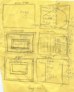

I had a gander at a few existing websites, www.johnny-flynn.com being one that heavily influenced my wireframe. The idea of a border, and inset of text seemed one that’d be nice and simple, n not too much of a ball ache to create for a first website. I ended up adapting it quite a lot, but the basic set up is there.
Another website was gilesgoodenmusic.co.uk .its about the simplest thing ever, and the idea of pure images and hotspots rather than text links that go that shitty purple when you click on them was something I was definitely swayed towards. Haha I liked his site so much I gave him an email telling him. He wasn’t too impressed.
 I knew right from the offset I wanted to have some kind of interactive navigation, I wanted to get stuck into flash and have some sort of animation game thing going on, but since computers are my kryptonite, I gave up after a few hours of messing around and getting no where. It’s something I’m gonna youtube up on ready for my second attempt.
I ended up having a few illustrations for the Home, About, Portfolio and Contact page. Tadaaa


Cos I’m just oozing with wit, I changed it to brain for home, guts for about, and soul for work, the contact button changed depending on the surroundings of the page, or the world you entered. Lack of time management led me to making my fifth page a simple enter the site thing. Haha.
the whole theme i wanted to go for was every page being different environment, a new world that was full of weird and wonderful things to have a look at, my lack of skills stopped any of them being playable.ive probably already written this abit further up the page but its 8 o clock and ive just woken from a nap, and im in a rush.


I had a gander at a few existing websites, www.johnny-flynn.com being one that heavily influenced my wireframe. The idea of a border, and inset of text seemed one that’d be nice and simple, n not too much of a ball ache to create for a first website. I ended up adapting it quite a lot, but the basic set up is there.
Another website was gilesgoodenmusic.co.uk .its about the simplest thing ever, and the idea of pure images and hotspots rather than text links that go that shitty purple when you click on them was something I was definitely swayed towards. Haha I liked his site so much I gave him an email telling him. He wasn’t too impressed.

I ended up having a few illustrations for the Home, About, Portfolio and Contact page. Tadaaa


 |
Cos I’m just oozing with wit, I changed it to brain for home, guts for about, and soul for work, the contact button changed depending on the surroundings of the page, or the world you entered. Lack of time management led me to making my fifth page a simple enter the site thing. Haha.
the whole theme i wanted to go for was every page being different environment, a new world that was full of weird and wonderful things to have a look at, my lack of skills stopped any of them being playable.ive probably already written this abit further up the page but its 8 o clock and ive just woken from a nap, and im in a rush.

Tuesday, 15 February 2011
everythings gettin well above my head

i need t start making time for jus illustrating and messin around without it needing to be for anything.
sat down to carry on with my website and it just isnt me, i think im gonna re do the whole thing, gotta lot to do now, just started animation.
im about 6 blog posts behind,and stuff is gettin about outta hand.

Monday, 14 February 2011
HASMITA CHAVDA ! for you mate.

hotmails playin games and wont let me attach any pictures, or any thing so my illustration for The Wave is on 'ere.
the other one was abit of a mess so ive ditched it.
Friday, 11 February 2011
Subscribe to:
Posts (Atom)