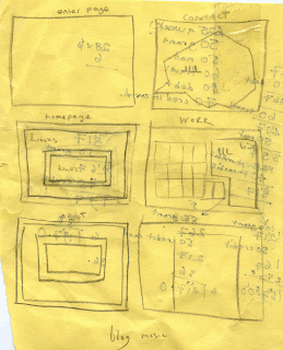
I had a gander at a few existing websites, www.johnny-flynn.com being one that heavily influenced my wireframe. The idea of a border, and inset of text seemed one that’d be nice and simple, n not too much of a ball ache to create for a first website. I ended up adapting it quite a lot, but the basic set up is there.
Another website was gilesgoodenmusic.co.uk .its about the simplest thing ever, and the idea of pure images and hotspots rather than text links that go that shitty purple when you click on them was something I was definitely swayed towards. Haha I liked his site so much I gave him an email telling him. He wasn’t too impressed.
I knew right from the offset I wanted to have some kind of interactive navigation, I wanted to get stuck into flash and have some sort of animation game thing going on, but since computers are my kryptonite, I gave up after a few hours of messing around and getting no where. It’s something I’m gonna youtube up on ready for my second attempt.
I ended up having a few illustrations for the Home, About, Portfolio and Contact page. Tadaaa
 |
Cos I’m just oozing with wit, I changed it to brain for home, guts for about, and soul for work, the contact button changed depending on the surroundings of the page, or the world you entered. Lack of time management led me to making my fifth page a simple enter the site thing. Haha.
the whole theme i wanted to go for was every page being different environment, a new world that was full of weird and wonderful things to have a look at, my lack of skills stopped any of them being playable.ive probably already written this abit further up the page but its 8 o clock and ive just woken from a nap, and im in a rush.


No comments:
Post a Comment